Bonne Maman
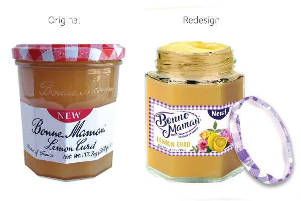
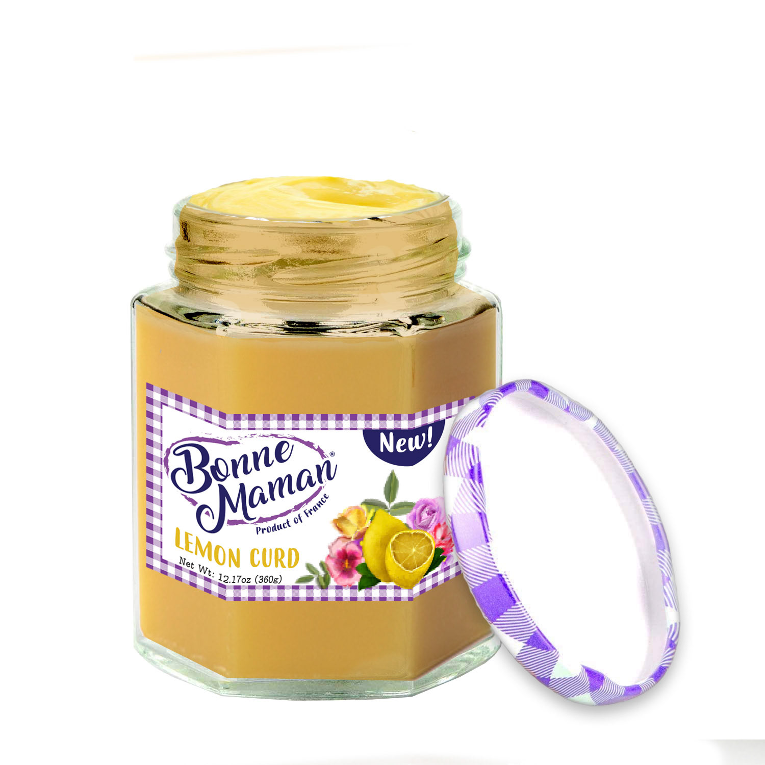
When I first saw the original Bonne Maman product, the first thing that I saw was how little design it had whatsoever and this is why I took the brand on as a mock client. The website was actually fairly well put together, but the actual product didn’t have much to boast. Taking a first glance at the product did not fair well for legibility – the customer had to spend more than a second to read what it was.
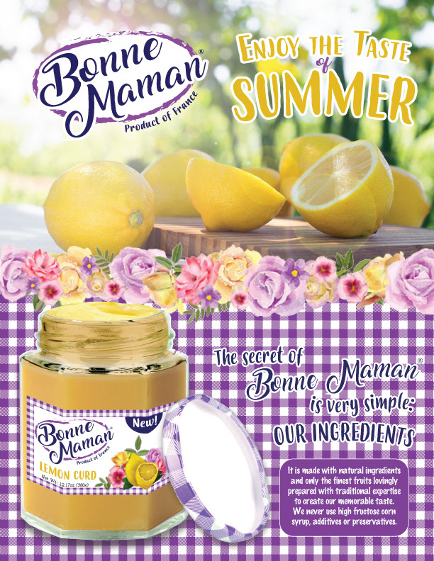
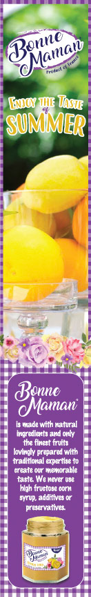
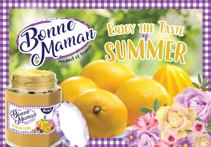
My goal for the redesign was to create something bright, colorful and eye-catching. The first two words that crossed my mind when looking at the original product was ‘picnic’ and ‘lemon.’ From those words, I immediately I pictured a picnic while serving lemons (lemonade) and it really placed me in a moment of enjoying lemonade on a summer day. That’s where ‘Enjoy the Taste of Summer’ came from and it took off from that point. I chose fonts that were fun and easy to read, but still had a homemade feel. The product was clearly intended to look homemade, so I did not want to take that aspect away from the final design.
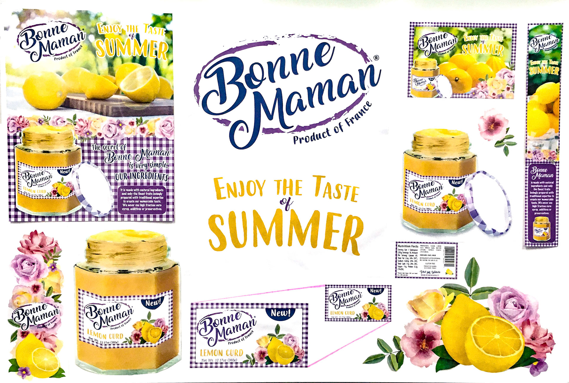
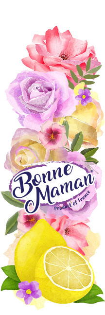
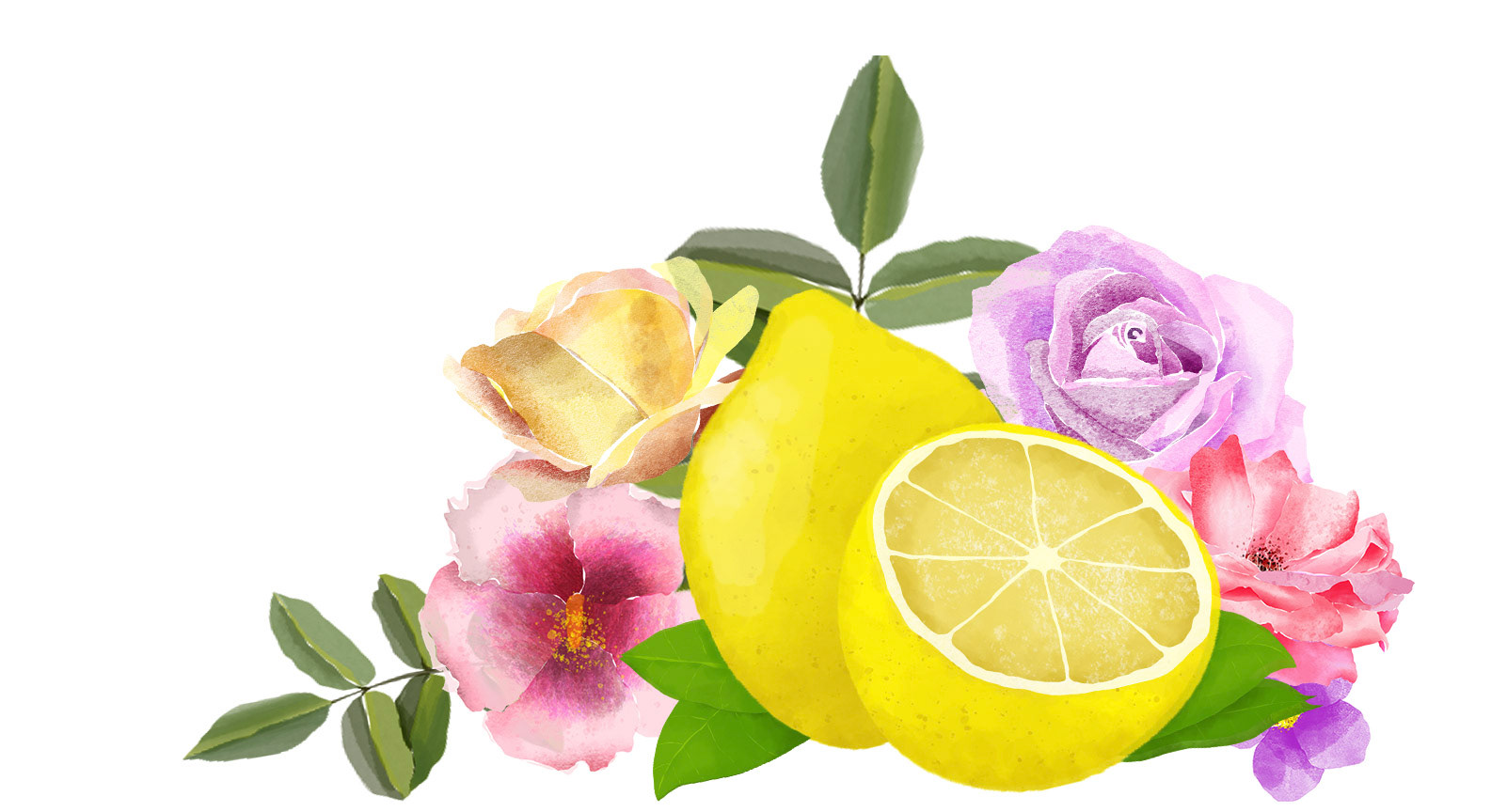
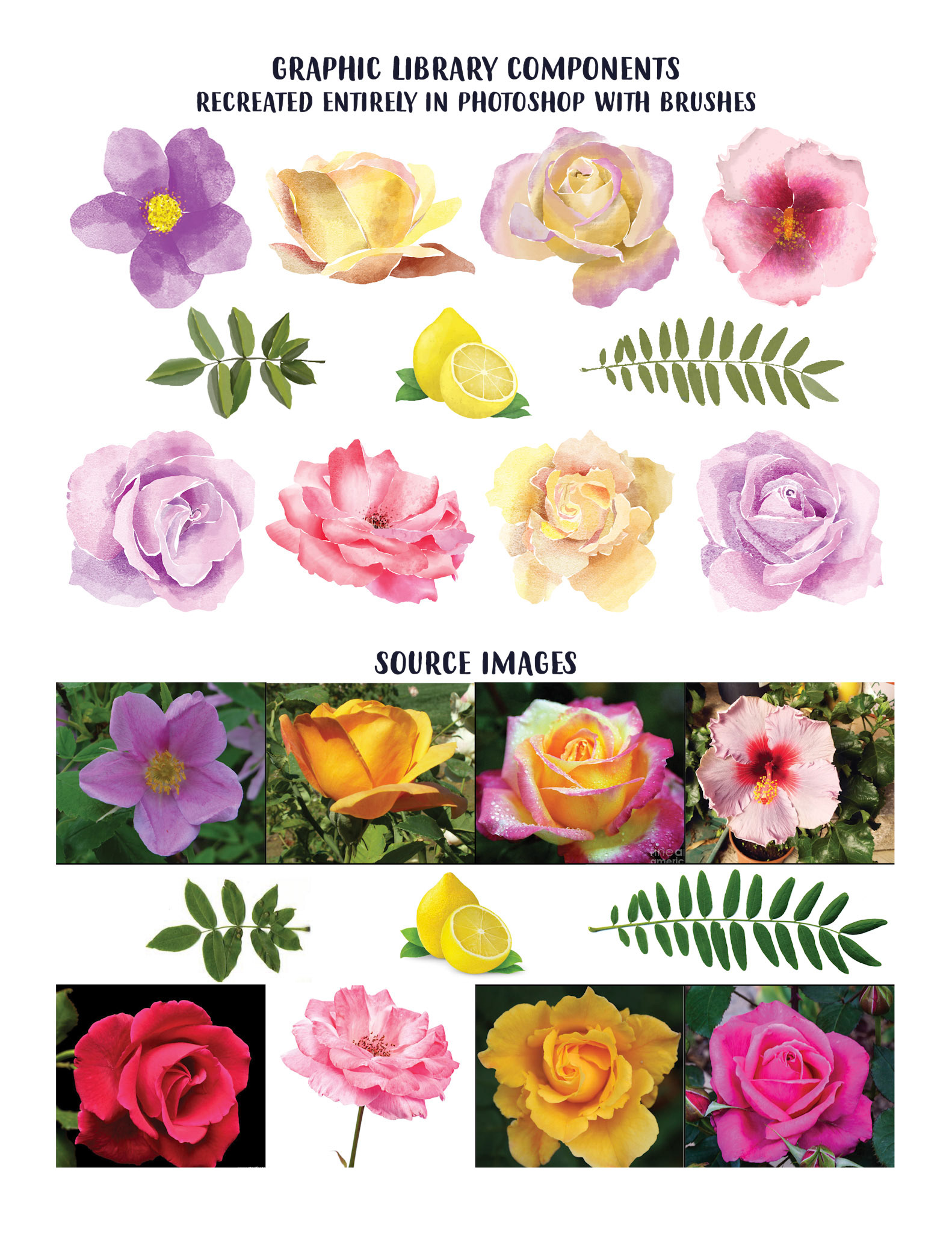
Keeping with the summer theme, I knew I wanted to add flowers to it and give it an almost ‘Country Chic’ impression. I created the flowers using only watercolor brushes and the lasso tool in Photoshop. This was the most time consuming part of the project, but I felt it was well worth it and those flowers are now part of my collection.
The project required a magazine spread, a magazine side advertisement and something that could be placed in a newspaper. I chose to take those a step further and created a few additional elements like the lemon floral display to compliment the look.
When this was presented to my fellow classmates, it was very well received and the feedback was that it looked professional and nicely put together.